Unlocking the Power of Font Types: A Deep Dive into Typography
Ever notice how a simple change in lettering can dramatically alter the feel of a design? That’s the power of typography, the art and technique of arranging type to make written language legible, readable, and appealing when displayed. And at the heart of typography lies the font type, the specific design of a set of characters – the letters, numbers, and symbols that make up our written communication. Choosing the right typeface is akin to selecting the right outfit; it can communicate professionalism, playfulness, or even authority.
Understanding font type families and classifications is essential for anyone working with text, whether you’re a seasoned designer, a budding blogger, or simply crafting an email. It’s about more than just making things “look nice”; it’s about effectively communicating your message. The wrong font choice can confuse your audience, diminish your credibility, or even completely undermine your message. Imagine a wedding invitation in Comic Sans – the message might be sincere, but the typeface undermines the formality of the occasion.
The history of typographic styles is rich and fascinating, evolving alongside writing itself. From the earliest handwritten scripts to the advent of the printing press and the digital revolution, typeface designs have constantly adapted and diversified. Each style carries its own baggage, its own story, and its own set of associations. Think of the timeless elegance of Garamond, often used in books and magazines, or the bold impact of Impact, a frequent choice for headlines. Each typeface evokes a different feeling, influencing how we perceive the text.
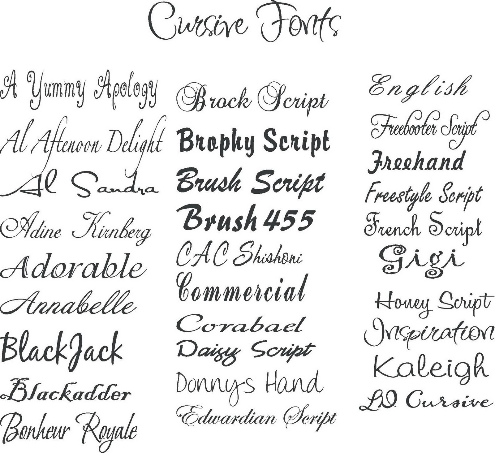
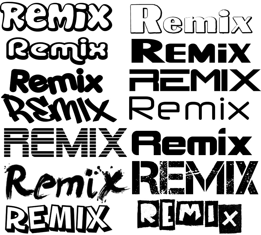
Navigating the world of typefaces can be daunting. With thousands of fonts available, how do you choose the right one? It's about understanding the nuances of each font family – serif, sans-serif, script, display, and monospace – and how they contribute to readability, legibility, and overall aesthetic. For instance, serif typefaces, characterized by small decorative strokes at the ends of letterforms like Times New Roman, are often perceived as traditional and trustworthy, while sans-serif fonts like Arial, lacking those strokes, appear more modern and clean.
Beyond the basic classifications, understanding the subtleties within each family is crucial. The weight, width, and style of a typeface can further refine its personality. A bold Helvetica conveys strength and confidence, while a light italicized version might suggest elegance or fragility. Mastering the art of typeface selection is about recognizing these subtle differences and leveraging them to enhance your message.
One benefit of understanding font type categories is improved readability. Choosing a typeface designed for long-form reading, like a serif font with appropriate spacing and weight, enhances the reader's experience.
Another advantage is establishing a consistent brand identity. Selecting specific type families for logos, headings, and body text creates a cohesive visual language that reinforces brand recognition. For example, a tech company might opt for a clean, modern sans-serif font to reflect its innovative spirit.
Finally, skillful typeface implementation can enhance the overall aesthetic appeal of a design. By thoughtfully pairing different typefaces and considering their visual harmony, you can elevate the look and feel of any project, from a website to a printed brochure.
Advantages and Disadvantages of Specific Font Types
| Font Type | Advantages | Disadvantages |
|---|---|---|
| Serif | Readability in print, traditional feel | Can appear cluttered on screen, less modern |
| Sans-serif | Clean, modern appearance, good for screen readability | Can lack personality, less readable in large blocks of print |
Frequently Asked Questions about Font Types:
What is the difference between a font and a typeface? (A typeface is the design, while a font is a specific weight and style within that typeface.)
Where can I find free fonts? (Websites like Google Fonts and DaFont offer a wide selection of free typefaces.)
How many fonts should I use in a single design? (It's generally recommended to stick to two or three fonts for visual consistency.)
What is kerning? (Kerning is the adjustment of space between individual letter pairs.)
What is leading? (Leading refers to the vertical spacing between lines of text.)
What is tracking? (Tracking is the adjustment of space between all letters in a word or line.)
What are web-safe fonts? (Web-safe fonts are typefaces commonly installed on most computers, ensuring consistent display across different browsers and operating systems.)
How can I choose the right font for my project? (Consider the target audience, the message you want to convey, and the overall aesthetic of the design.)
Tip: Experiment with different font pairings to find combinations that complement each other.
In conclusion, the world of typography and font types is vast and nuanced. From the historical significance of typeface design to the practical considerations of readability and aesthetics, understanding the power of fonts is crucial for effective communication. Choosing the right typeface can transform a simple piece of text into a powerful statement, enhancing readability, reinforcing brand identity, and elevating the overall aesthetic appeal of your work. By exploring the various font families, understanding their characteristics, and experimenting with different combinations, you can unlock the full potential of typography and ensure your message resonates with your audience. Take the time to explore, experiment, and refine your typographic choices – the impact on your communication will be well worth the effort. This knowledge empowers you to make informed decisions about typography, ultimately enhancing your communication and design skills. So, dive into the world of font types and discover the transformative power of typography!
Anthony michael tattoo artistry in tucson
Ea fc 24 ps5 digital edition deep dive
Unlocking creativity exploring the world of hello kitty coloring pages


