The Two-Inch Type: A Deep Dive into Large-Scale Typography
Imagine a letterform, a single glyph, towering two inches tall. What whispers of meaning does such a scale impart? How does it command attention, shape perception, and redefine the very act of reading? This exploration delves into the realm of two-inch typography, uncovering its practicalities and pondering its philosophical implications.
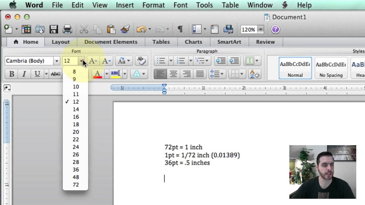
Determining the specific point size that translates to a two-inch character height isn't a simple equation. The inherent proportions of different typefaces complicate the process. A two-inch capital 'A' in a narrow typeface will correspond to a different point size than a two-inch 'A' in a wider one. The x-height, the height of the lowercase 'x', also influences the overall perceived size. Therefore, achieving a precise two-inch letter height necessitates experimentation and careful measurement within your chosen design software.
The need for such grand typography arises in various contexts. Consider the bold pronouncements of billboards designed to catch the eye of speeding motorists, or the wayfinding signage in sprawling airports, guiding travelers across vast distances. These are but a few examples where legibility from afar demands an outsized typographic presence.
Historically, achieving such large-scale lettering was a labor-intensive process, involving hand-painted signs, stencils, and even projected images painstakingly traced and filled in. The digital revolution, however, democratized this process, placing the power to create two-inch type—and beyond—in the hands of anyone with a computer and design software.
Understanding the relationship between point size, font family, and the final printed output is paramount in this endeavor. Software like Adobe Illustrator, Photoshop, and InDesign provide the tools to manipulate type at this scale. Begin by selecting your desired typeface, considering its visual impact and readability at large sizes. Experiment with different point sizes, printing test versions to ensure the final output matches your vision. Remember that the viewing distance significantly impacts the effectiveness of large-scale typography.
One key benefit of large type is its unparalleled ability to command attention. In a world saturated with visual stimuli, a two-inch letterform cuts through the noise, demanding to be seen. This makes it incredibly effective for signage, banners, and other attention-grabbing displays.
Secondly, large typography can enhance readability at a distance. This is crucial in environments like airports, stadiums, and highways where information needs to be quickly and easily grasped from afar. The sheer size of the characters ensures clarity even from significant distances.
Finally, oversized typography can be a powerful tool for artistic expression. From striking murals to dramatic stage sets, large-scale lettering can imbue a space with a unique sense of energy and character. Think of the iconic Hollywood sign, a testament to the enduring impact of monumental typography.
Advantages and Disadvantages of Two-Inch Typography
| Advantages | Disadvantages |
|---|---|
| High Visibility | Space Constraints |
| Improved Readability at a Distance | Potential Overwhelm |
| Enhanced Artistic Expression | Printing Challenges |
Five best practices for implementing two-inch typography include: 1. Choosing a clear, readable typeface. 2. Considering the viewing distance. 3. Testing printed outputs at scale. 4. Using high-resolution images. 5. Ensuring proper spacing and kerning.
Frequently Asked Questions:
1. What point size is a 2-inch font? This depends on the typeface and its specific proportions. Experimentation is key.
2. What software is best for creating large-scale type? Adobe Illustrator, Photoshop, and InDesign are commonly used.
3. Can I print two-inch type at home? It depends on your printer capabilities; larger formats may require professional printing services.
4. What materials are best for large-scale typography? This depends on the application; consider vinyl banners, large-format posters, or even painted surfaces.
5. How do I measure the height of my type accurately? Use the rulers and measurement tools within your design software.
6. What are some common mistakes to avoid? Ignoring kerning and spacing, choosing illegible fonts, and not considering the viewing distance.
7. How can I create a two-inch letter in Microsoft Word? While possible, Word has limitations; design software offers greater control for large-format projects.
8. Are there online tools for generating large-scale type? Yes, various online tools and generators can assist with this process.
In conclusion, the journey into the world of two-inch type is a fascinating exploration of scale, legibility, and visual impact. From the practical considerations of font choice and software manipulation to the broader implications for artistic expression and public communication, large-scale typography holds a unique place in the visual landscape. By understanding its nuances and employing best practices, we can harness the power of oversized lettering to command attention, convey meaning, and transform the very way we experience the written word. Explore the possibilities, experiment with different approaches, and discover the transformative potential of two-inch typography.
Aluminum wheel torque your rides secret weapon
Super bowl 49 unpacking the dramatic game stats
Fantasy football draft pick 5 dominate your league


