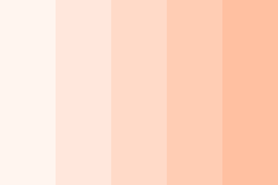
The Subtle Charm of #fadfad: Why This Peachy Yellow Hue Deserves Your Attention
In the world of design, color is a powerful tool, capable of evoking emotions, shaping perceptions, and influencing decisions. While vibrant hues and bold shades often take center stage, there's a certain allure to subtle, understated colors that whisper rather than shout. One such color is the delicately balanced peach-yellow represented by the hex code #fadfad.
Imagine the soft glow of a sunrise, the gentle blush of a seashell, or the velvety texture of a ripe peach. These are the associations conjured by #fadfad, a color that embodies warmth, tranquility, and a touch of understated elegance. Unlike its brighter, more saturated counterparts, #fadfad possesses a unique ability to create a sense of calm and serenity without feeling dull or lifeless.
But #fadfad is more than just a pretty color. Its versatility allows it to seamlessly integrate into a wide range of design aesthetics. Whether you're aiming for a minimalist and modern look, a romantic and vintage feel, or a playful and energetic vibe, this adaptable hue can complement and enhance your design choices.
One of the reasons #fadfad works so well across different styles is its inherent balance. It sits harmoniously between yellow and orange on the color wheel, embracing the cheerful optimism of yellow while retaining the gentle warmth of orange. This delicate balance gives #fadfad a unique ability to evoke both energy and tranquility, making it an ideal choice for projects that aim to strike a harmonious chord.
However, the true beauty of #fadfad lies in its subtlety. It's not a color that demands attention; instead, it gracefully enhances its surroundings, creating a sense of spaciousness and airiness. This makes it an excellent choice for backgrounds, where it can provide a neutral canvas for other elements to shine without overpowering the overall design.
Advantages and Disadvantages of #fadfad
Like any color, #fadfad comes with its own set of advantages and disadvantages. Understanding these nuances can help you utilize this versatile hue effectively in your design projects.
| Advantages | Disadvantages |
|---|---|
| Creates a sense of warmth and tranquility | Can appear washed out if not paired carefully |
| Versatile and adaptable to various design styles | May not be suitable for projects requiring high contrast |
| Provides a subtle and elegant backdrop for other elements | Can be perceived as overly feminine or delicate in some contexts |
Best Practices for Implementing #fadfad
While #fadfad is a versatile color, there are a few best practices to keep in mind when incorporating it into your designs:
- Pair it with complementary colors: #fadfad works beautifully with a range of colors, including navy blue, deep green, charcoal gray, and even muted shades of pink or purple.
- Use it strategically for backgrounds: Its subtle nature makes it an ideal choice for backgrounds, allowing other design elements to take center stage.
- Experiment with different textures: Adding texture can enhance the visual interest of #fadfad. Consider using it in combination with linen textures, watercolor effects, or even subtle gradients.
- Don't be afraid to play with contrast: While #fadfad is known for its subtlety, don't shy away from pairing it with bolder accents to create visual interest.
- Consider the emotional impact: Keep in mind the emotions you want to evoke in your design and use #fadfad accordingly. Its calming and peaceful nature makes it well-suited for projects related to wellness, mindfulness, or nature.
From minimalist websites to whimsical illustrations, the possibilities with #fadfad are endless. Its delicate balance of warmth, tranquility, and understated elegance makes it a versatile tool for designers looking to create visually appealing and emotionally resonant designs.
In a world saturated with vibrant colors vying for attention, #fadfad stands out as a breath of fresh air. Its gentle charm and understated sophistication offer a welcome respite from the visual noise, reminding us that sometimes, the most captivating beauty lies in the subtle and serene.
Exploring the literary landscape of langston hughes fiction
The unsettling image of the gas mask guy with gun
The power of weekly reflections unlocking your potential through thought


