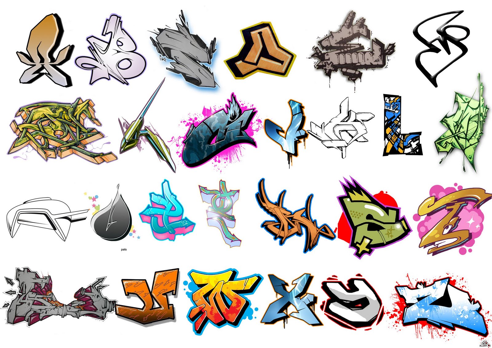
The Art of the 'B': Deconstructing a Graffiti Icon
In the urban jungle, where concrete canvases tell silent stories, the alphabet takes on a life of its own. Graffiti, a vibrant and often controversial art form, transforms mundane letters into powerful expressions of creativity and rebellion. Among these typographic rebels, the letter 'B' stands out, a chameleon-like character adaptable to countless styles and interpretations.
Imagine a bustling city street, the air thick with the smell of fresh paint. Your eyes are drawn to a wall emblazoned with a kaleidoscope of colors and shapes—a graffiti mural. But look closer, beyond the initial visual cacophony, and you'll begin to decipher individual letters, each a microcosm of the artist's style and personality. The 'B,' in particular, often serves as a foundational element, its curves and angles lending themselves to both bold simplicity and intricate detail.
From the rounded, bubble-like 'B's' of classic bubble letter styles to the sharp, angular forms found in wildstyle graffiti, the letter 'B' offers endless creative possibilities. It can be stretched, squashed, intertwined with neighboring letters, or adorned with arrows, stars, and other embellishments. Its versatility makes it a favorite among graffiti artists, who constantly push the boundaries of typography, transforming the humble 'B' into a visual symphony of line, shape, and color.
Understanding the 'B' in graffiti goes beyond mere aesthetics. It's about deciphering a visual language, one that speaks of urban subcultures, social commentary, and the raw energy of artistic expression. The way a 'B' is crafted can reveal influences from different graffiti crews, geographic locations, and even the individual artist's personal experiences. By learning to appreciate the nuances of this single letter, we gain a deeper understanding of the rich and complex world of graffiti art.
Let's embark on a journey into the heart of graffiti lettering, exploring the evolution, techniques, and cultural significance of the letter 'B'. We'll delve into the history of graffiti, examining how the 'B' has been shaped by different styles and movements. We'll analyze the techniques used to create various 'B' forms, from basic outlines to complex 3D effects. And we'll explore the cultural impact of graffiti lettering, considering its role in urban landscapes, popular culture, and beyond.
Whether you're a seasoned graffiti enthusiast or a curious newcomer, join us as we decode the secrets of the 'B' and unlock the creative potential of this iconic letterform in the world of graffiti art.
Advantages and Disadvantages of Using Different 'B' Styles in Graffiti
| Style | Advantages | Disadvantages |
|---|---|---|
| Bubble Letter 'B' | Easy to read, playful and approachable aesthetic | Can appear simplistic, less suitable for complex pieces |
| Wildstyle 'B' | Highly stylized, demonstrates technical skill, visually impactful | Difficult to read, requires advanced skills, time-consuming |
| 3D 'B' | Adds depth and dimension, visually striking | Requires perspective skills, can be challenging to execute well |
The 'B' in graffiti is more than just a letter; it's a symbol of creativity, rebellion, and the power of urban art. By understanding its history, techniques, and cultural context, we can better appreciate the artistry and impact of this often-misunderstood art form.
Unlocking interior design magic with valspar paint colors
Renew your california drivers license online a simple guide
The enduring appeal of the anime boy with yellow hair


