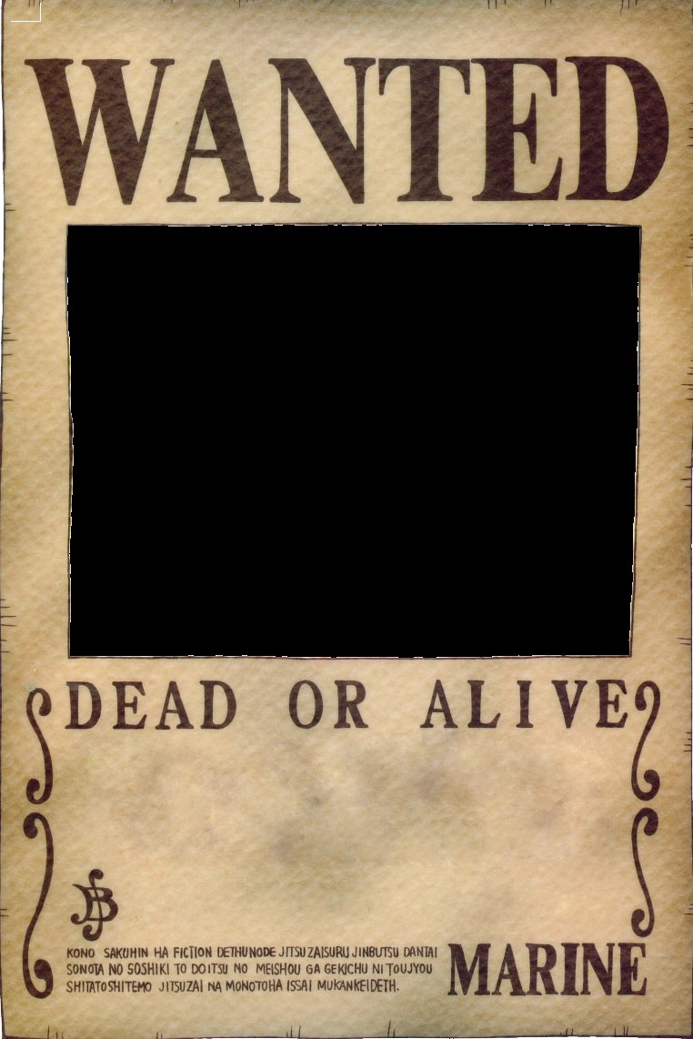
One Piece Wanted Poster Font: Decode the Grand Line's Typography
Ever wondered what font graces the infamous wanted posters in One Piece? That distinctive, bold typeface plastered across the Grand Line, declaring bounties on the heads of pirates and revolutionaries alike, has a certain allure. It’s more than just a font; it's a symbol, a declaration, a piece of the One Piece universe itself.
Finding the perfect match for the One Piece wanted poster lettering style has become a quest for many fans. It's a common topic of discussion across online forums and design communities. So, what's the deal with this highly sought-after typeface, and how can you capture its essence in your own creative projects?
The aesthetic of the One Piece wanted posters, with their stark black and white contrast and impactful typography, is instantly recognizable. The typography plays a crucial role in conveying the gravity of the situation – a visual representation of the world government's pursuit of these individuals. But replicating that look isn't as simple as typing into Word.
The typeface used for the 'WANTED' heading isn't a single, easily downloadable font. It’s a custom design, likely inspired by various western-style fonts commonly seen in old-timey wanted posters. This means finding a perfect one-to-one match is practically impossible. However, several fonts come remarkably close, offering a similar bold, condensed, and slightly distressed feel. Names like Cooper Black, Impact, and Franklin Gothic Heavy are often suggested as potential alternatives, each offering a slightly different take on the desired aesthetic.
Beyond the "WANTED" header, the body text on the posters presents another typographic challenge. It requires a clear, legible font that complements the headline while maintaining the overall thematic consistency. Fonts like Clarendon, Rockwell, or even a slightly condensed version of Times New Roman can work well for this purpose, providing a strong, readable counterpart to the bolder headline.
Historically, wanted posters have relied on bold, impactful fonts to grab attention and convey urgency. The One Piece posters draw inspiration from this tradition, adapting the style to fit the unique world of pirates and the Grand Line. The importance of this font choice lies in its ability to instantly communicate the significance of the poster, adding to the immersive experience of the One Piece universe.
One common issue fans face is finding a free font that accurately replicates the One Piece style. While some close alternatives are freely available, achieving a truly accurate match often requires investing in premium fonts or utilizing graphic design software to customize existing options.
One benefit of emulating the One Piece font style is the ability to create compelling fan art, ranging from custom wanted posters featuring original characters to stylized text graphics for social media or online communities. It also offers a fun exercise in graphic design, allowing fans to explore and experiment with different typographic styles.
If you're aiming for a close replica, start by experimenting with freely available fonts like Cooper Black or Impact. Adjust the kerning, letter spacing, and potentially add a subtle distress effect to achieve a closer resemblance to the original. For a truly authentic look, consider commissioning a custom font design.
Advantages and Disadvantages of Using Similar Fonts
| Advantages | Disadvantages |
|---|---|
| Easily accessible free alternatives | Perfect match is difficult to achieve |
| Allows for creative fan projects | May require investment in premium fonts |
Frequently Asked Questions:
1. What font is the 'WANTED' on One Piece posters? - A custom design, likely inspired by western-style fonts.
2. Where can I download the One Piece font? - A perfect replica isn't available for download, but similar fonts can be found.
3. What are some good alternatives to the One Piece font? - Cooper Black, Impact, Franklin Gothic Heavy.
4. What font is used for the body text on the posters? - Clarendon, Rockwell, or a condensed Times New Roman are potential choices.
5. How can I make my own One Piece wanted poster? - Use graphic design software and similar fonts, adjusting kerning and spacing.
6. Is the One Piece font free? - Close alternatives are free, but a perfect match may require a premium font.
7. Can I use the One Piece font for commercial purposes? - Usage depends on the specific license of the font you choose.
8. How can I add a distressed look to the font? - Graphic design software can add effects like texture and weathering.
One tip for enhancing the authenticity of your One Piece font replica is to add a subtle paper texture or a slight grunge effect, mimicking the aged look of real wanted posters. This adds a layer of realism and reinforces the thematic connection to the One Piece world.
The allure of the One Piece wanted poster font lies in its immediate connection to the vibrant world of pirates, adventure, and the Grand Line. While a precise replication of the custom-designed font remains elusive, utilizing similar typefaces and employing design techniques allows fans to capture the essence of the posters’ distinctive style. By experimenting with freely available alternatives and exploring graphic design tools, you can unlock the secrets behind the Grand Line’s typography and embark on your own creative journey. Whether crafting fan art, designing custom merchandise, or simply exploring your artistic side, the world of One Piece typography offers a wealth of possibilities. So, set sail and discover the power of the wanted poster font, and let your creativity run wild on the open seas of design!
Finding focus bypassing distractions in harrisonburg
Lei shing hong singapore your gateway to premium automotive experiences
Lost your routing number dont panic your guide to finding it


