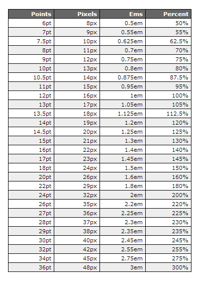
Font Point Size Drama: Is Your Text Whispering or Screaming?
So, you think font point size is boring? Think again. It’s the silent assassin of good design, the unsung hero of readability, the diva demanding attention. Pick the wrong font size, and your meticulously crafted message might as well be written in invisible ink. Choose wisely, and your words will sing. But seriously, are you using 12pt Times New Roman for everything? Because honey, that's so 2003.
Font point size, often overlooked, is the crucial element determining how your text is perceived. It's not just about aesthetics; it’s about accessibility, usability, and ultimately, the effectiveness of your communication. Whether you're crafting a website, designing a poster, or just writing an email, the point size you select can make or break your message. Are you yelling at your readers with gigantic, in-your-face headlines? Or are they squinting to decipher your teeny-tiny body text? Let's face it, nobody wants to work that hard to read your content.
Historically, point size has its roots in the pre-digital era of typesetting. Back then, physical type was measured in points, and these measurements dictated the size of the printed characters. One point equals approximately 1/72 of an inch. While the methods of typesetting have evolved dramatically, the concept of point size has remained a cornerstone of typography. It’s the language we use to communicate about font dimensions, bridging the gap between designers, printers, and even casual computer users.
The importance of understanding font point size cannot be overstated. In the digital age, where content is consumed across a multitude of devices with varying screen sizes and resolutions, selecting appropriate font sizes is paramount for ensuring readability and accessibility. Imagine trying to read a dense academic paper on your phone with a 6pt font. Nightmare, right? That’s why optimizing font sizes for different viewing contexts is crucial for effective communication. It’s about respecting your audience and making it easy for them to engage with your content.
A common issue related to point size is inconsistency. Switching randomly between different font sizes within a single document can create a jarring, unprofessional look. This visual chaos can distract readers and undermine the credibility of your message. Think of it like a rollercoaster ride for your eyes – exciting at first, but ultimately nauseating. Consistency in font size helps create a cohesive and visually appealing experience for the reader, allowing the content to shine.
One point equals 1/72 of an inch. A 12pt font means the letters are approximately 12/72 of an inch tall. Simple enough, right? But the actual size rendered on screen can vary based on factors like screen resolution and font design.
Benefits of Using Appropriate Font Point Sizes:
1. Enhanced Readability: Larger font sizes are generally easier to read, particularly for those with visual impairments. A 12pt font is a common standard for body text.
2. Improved Accessibility: Proper font sizing makes content accessible to a wider audience, including those with low vision or dyslexia.
3. Professional Appearance: Consistent and appropriate font sizes contribute to a polished and professional look, enhancing credibility and trust.
Advantages and Disadvantages of Different Font Point Sizes
| Point Size | Advantages | Disadvantages |
|---|---|---|
| Small (e.g., 8pt) | Fits more text in a limited space | Difficult to read, especially for extended periods |
| Medium (e.g., 12pt) | Good balance between readability and space efficiency | May not stand out enough for headlines |
| Large (e.g., 16pt+) | Highly readable, good for headlines and displays | Takes up more space, may seem overwhelming for body text |
Best Practices:
1. Consider your target audience and their reading habits.
2. Test different font sizes on various devices.
3. Maintain consistency throughout your document.
4. Use larger sizes for headlines and smaller sizes for body text.
5. Prioritize readability above all else.
FAQ:
1. What is the standard font size for body text? Generally, 12pt.
2. How does font size affect readability? Larger sizes are easier to read.
3. What is the relationship between point size and inches? 1 point is 1/72 of an inch.
4. How do I choose the right font size for my website? Consider your target audience and test different sizes.
5. Can I change the font size in my email client? Yes, most email clients allow you to adjust font size.
6. What is the ideal font size for print materials? It depends on the specific application, but 12pt is a common starting point for body text.
7. How does screen resolution impact font size? Higher resolution screens can display smaller fonts more clearly.
8. What is the difference between font size and font weight? Font size refers to the height of characters, while font weight refers to the thickness of the strokes.
In conclusion, mastering the art of font point size selection is a critical skill for anyone communicating through the written word. It's not just about aesthetics; it’s about ensuring your message is accessible, readable, and effective. From the historical origins of point size to its practical application in modern design, understanding this fundamental element of typography can empower you to create content that resonates with your audience. So, take the time to consider the point size of your text. Your readers will thank you for it. Don’t let your message get lost in the noise – make sure your font size is just right.
Tune in to nostalgia the enduring appeal of am 1480 new york radio station
Transform your bathroom with a stunning bathtub surround
Conquering the cold your guide to winterizing a yamaha 2 stroke outboard


