Elevate Your Football Edits: Finding the Perfect Font in CapCut (PC)
Want to take your football edits to the next level? Choosing the right font can make all the difference. A well-chosen typeface can add drama, excitement, and a professional touch to your CapCut creations. This article will dive deep into the world of fonts, specifically for football edits on CapCut for PC.
Finding the ideal font can be overwhelming. There are countless options available, each with its own unique style and personality. The goal is to select a font that complements your footage, enhances the overall message, and resonates with your audience. Whether you're creating highlight reels, game analyses, or fan tributes, the font you choose plays a crucial role in the final product's impact.
Think about the emotion you want to convey. Is it the intensity of a game-winning goal, the camaraderie of a team celebration, or the nostalgic feel of a historical recap? The right font can amplify these emotions and make your edits more engaging. A bold, impactful font can emphasize a powerful moment, while a more classic typeface can lend an air of sophistication to historical content.
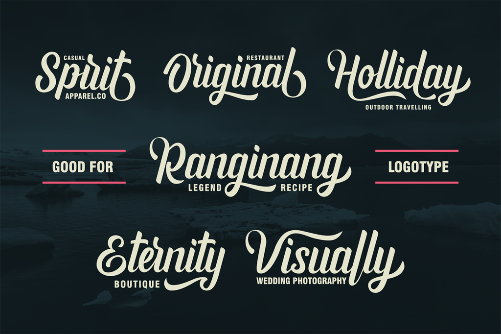
Historically, sports graphics have leaned towards bold, sans-serif fonts that convey strength and energy. However, with the rise of digital platforms and creative editing software like CapCut, the possibilities are endless. You can experiment with different font styles, including retro fonts, futuristic fonts, and even handwritten fonts, to create a unique and memorable aesthetic.
Choosing the optimal font for your football edits is not just about aesthetics; it's about effective communication. A clear and legible font ensures that your audience can easily read titles, player names, and other important information. Avoid overly stylized or decorative fonts that might hinder readability, especially on smaller screens. Remember, the goal is to enhance the viewing experience, not distract from it.
While CapCut doesn't have a dedicated "football font" category, it offers a wide array of options to choose from. Popular choices include impactful sans-serif fonts like Bebas Neue, Impact, and Montserrat, which are often used for titles and headings. For body text and player names, consider more readable options like Open Sans, Roboto, or Lato.
One benefit of using CapCut is its flexibility in importing custom fonts. If you have a specific font in mind that's not available within the software, you can easily download and install it on your PC and then import it into CapCut. This allows you to truly personalize your edits and create a unique brand identity.
Advantages and Disadvantages of Using Custom Fonts
| Advantages | Disadvantages |
|---|---|
| Unique branding | Compatibility issues |
| Wider design options | Time-consuming to find and install |
Best Practices for Implementing Fonts in CapCut:
1. Maintain Consistency: Use the same font family or a complementary combination throughout your edit for a cohesive look.
2. Prioritize Readability: Ensure your chosen font is easy to read, especially on smaller screens.
3. Consider Context: Choose fonts that align with the tone and style of your edit.
4. Experiment with Size and Spacing: Adjust font size and kerning (spacing between letters) to optimize readability and visual appeal.
5. Use Color Strategically: Use contrasting colors for text and background to ensure legibility.
FAQ:
1. How do I add custom fonts to CapCut on PC? Download the font file and install it on your system. CapCut should automatically recognize the new font.
2. What are some good free font resources? Google Fonts and DaFont are popular options.
3. Can I use different fonts for different parts of my edit? Yes, but aim for consistency.
4. How do I adjust font size in CapCut? Use the text editing tools within the software.
5. Are there any copyright restrictions on fonts? Some fonts have licensing restrictions, so check before using them commercially.
6. How do I avoid font compatibility issues? Stick to widely supported font formats like TTF and OTF.
7. What is kerning, and why is it important? Kerning is the adjustment of space between letters. It's crucial for readability and visual appeal.
8. How can I make my text stand out more? Use contrasting colors, add a subtle shadow, or experiment with outlines.
Tips and Tricks:
Use bold fonts for titles and headings.
Use italicized fonts for emphasis.
Experiment with different font pairings.
In conclusion, selecting the right font for your football edits in CapCut is crucial for creating visually appealing and engaging content. Consider the overall tone, message, and readability when making your choice. By following the tips and best practices outlined in this article, you can elevate your edits and captivate your audience. Remember, the perfect font can transform your football edits from amateur to professional, adding that extra layer of polish and impact that makes your content stand out. Take the time to explore different options, experiment with various styles, and discover the fonts that best represent your unique creative vision. Don't be afraid to try new things, and most importantly, have fun with the process! By carefully considering your font choices and applying these principles, you can enhance the overall quality and impact of your football edits, making them more memorable and engaging for your viewers. So, dive in, explore the world of fonts, and let your creativity flow!
Decoding the nyt logo the story behind its iconic font
Unlocking medicare your guide to original fee for service
Finding es lo que necesito your guide to discovering what you need


