Decoding Word's Default Font: Size Matters
Ever opened a fresh Word document and wondered about that initial font size? It's more than just a starting point; it's a foundational element shaping how we read and interact with digital text. This seemingly simple setting has a rich history, influences document accessibility, and plays a vital role in effective communication.
The standard font size in Microsoft Word has evolved over time, reflecting changing technological landscapes and user needs. Initially tied to typewriter conventions, the default size has shifted alongside the rise of digital displays and the increasing importance of on-screen readability. Understanding this evolution helps us appreciate the considerations that go into setting a document's typographic foundation.
The pre-selected font size acts as a baseline, ensuring consistent readability across different devices and platforms. This consistency is crucial for accessibility, enabling individuals with visual impairments to access information comfortably. Furthermore, the standard size offers a neutral starting point for creating professional documents, contributing to a clean and polished presentation.
However, relying solely on the preset size can present challenges. It might not be suitable for all document types or reader demographics. For instance, a presentation slide might require a larger font size for visibility, while a dense academic paper may benefit from a smaller, more space-efficient size. This highlights the importance of understanding how to customize font sizes to meet specific needs.
Navigating the nuances of font size might seem trivial, but it significantly impacts a document's effectiveness. From readability and accessibility to professional presentation, the size we choose shapes how our message is perceived. This article delves deeper into the world of Word's default font size, offering practical insights and actionable strategies to optimize your documents.
The default font size in Word has historically been 12pt Times New Roman, reflecting traditional print media. Later, Calibri 11pt became the standard, aiming for better on-screen readability. This shift demonstrates a continuous effort to balance traditional conventions with modern digital needs.
A crucial aspect of Word's standard size is its role in accessibility. It provides a comfortable reading experience for many, ensuring that documents are accessible to a wider audience, including those with visual impairments.
One common issue is the temptation to stick with the preset size regardless of the document's purpose. This can lead to readability issues, particularly for presentations or documents intended for large-format printing.
A simple example is preparing a poster. The standard font size is unlikely to be large enough for viewers to read from a distance. Adjusting the font size is essential for effective communication in this context.
Benefits of adhering to a sensible initial font size include improved readability, ensuring accessibility for a wider audience, and projecting a professional image. For instance, a well-chosen font size prevents eye strain and enhances comprehension, especially for longer documents.
An action plan for managing font size involves understanding your audience and document purpose, selecting appropriate sizes for different elements (headings, body text, captions), and regularly reviewing your choices for optimal readability.
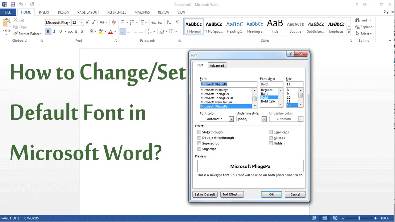
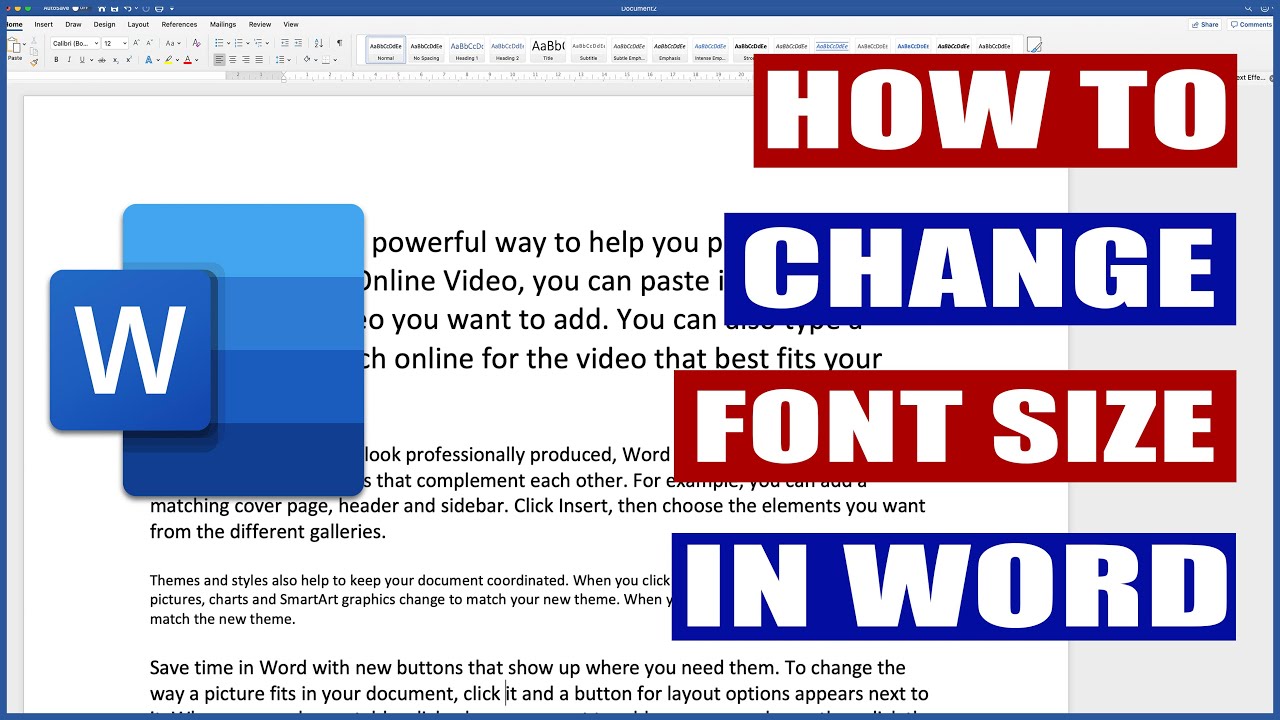
A step-by-step guide to changing the font size in Word involves highlighting the desired text, navigating to the font size menu in the Home tab, and selecting the preferred size.
Advantages and Disadvantages of Sticking to Default Font Size
| Advantages | Disadvantages |
|---|---|
| Ease of Use | Limited Flexibility |
| Initial Consistency | Potential Readability Issues |
| Familiarity for Users | Not Ideal for All Document Types |
Best practices include: 1. Considering the document's purpose and audience. 2. Testing different font sizes for readability. 3. Ensuring consistency throughout the document. 4. Using larger sizes for headings and subheadings. 5. Prioritizing accessibility.
Real examples: academic papers, business reports, marketing materials, website content, and presentation slides all require careful font size considerations for effective communication.
Challenges include readability on different screens, accessibility for visually impaired readers, and maintaining consistency across various devices. Solutions involve utilizing accessible font styles, testing across multiple platforms, and using relative font sizing.
FAQ:
1. What is the default font size in Word? (Generally 11pt.)
2. How do I change the default font size? (Via Word's settings.)
3. Why is font size important? (For readability and accessibility.)
4. How do I choose the right font size? (Consider audience and document purpose.)
5. What are the best practices for font sizes in presentations? (Larger sizes are generally recommended.)
6. How can I ensure my document is accessible for visually impaired readers? (Use clear fonts and appropriate sizes.)
7. Can I change the default font for all new documents? (Yes, through Word's template settings.)
8. What are some common mistakes to avoid with font sizes? (Inconsistent sizing, using overly small or large fonts.)
Tips and tricks: Use the zoom function to preview your document at different sizes, experiment with various fonts for optimal readability, and consult accessibility guidelines for recommended font sizes.
In conclusion, the default font size in Word is more than just a starting point; it’s a foundational element influencing readability, accessibility, and the overall effectiveness of your document. While the pre-set size provides a convenient base, understanding its history, benefits, and limitations empowers us to make informed typographic choices. By considering our audience, document purpose, and best practices, we can leverage font size as a powerful tool for clear, accessible, and impactful communication. This involves evaluating the readability on various devices, ensuring accessibility for all users, and maintaining consistent sizing throughout the document. Making informed choices about font size ensures that our message is received effectively, enhancing communication and creating a positive reading experience for everyone. Take the time to explore your options and tailor your font sizes to each document's unique needs for optimal impact.
Lil tony rising atl hip hop artist making waves
Embracing serenity with behrs lotus petal
Checking your jpa retirement status a comprehensive guide


