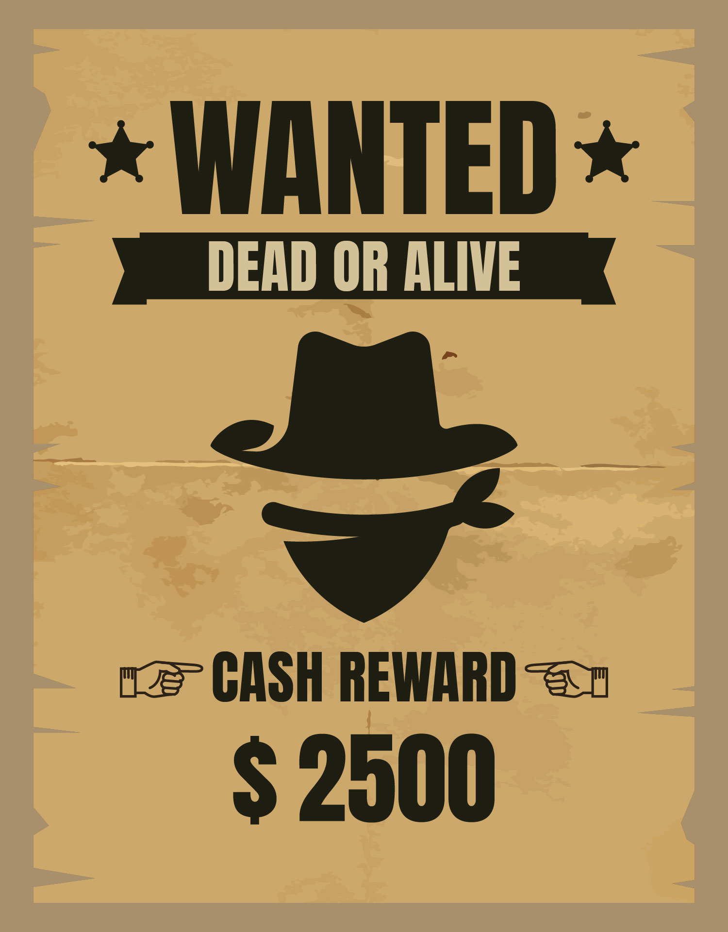
Decoding the Wild West Typography: The Enduring Allure of Wanted Poster Fonts
Imagine a dusty saloon, the creak of a swinging door, and a weathered poster plastered on the wall. Bold, imposing typefaces scream the name of a notorious outlaw, promising reward for capture. That iconic imagery is intrinsically linked to the typography employed – the "wanted poster font." But what makes these fonts so compelling, and how can you harness their power in your own designs?
These fonts, often characterized by slab serifs, bold strokes, and a touch of vintage flair, evoke a sense of drama, urgency, and the untamed spirit of the American West. They're more than just letters; they're a visual shorthand for a specific time and place, instantly recognizable and deeply embedded in our cultural consciousness. From movie posters to event flyers, these typefaces continue to resonate with audiences today, carrying a weight of history and a hint of rebellion.
The roots of the wanted poster typeface can be traced back to the era of wood type and letterpress printing. The need for clear, legible type that could be easily reproduced led to the development of bold, impactful styles. Think "Tuscan" or "Egyptian" typefaces, with their strong serifs and condensed letterforms. These type styles were perfectly suited to the rough-and-tumble world of frontier justice, where communication needed to be immediate and unmistakable.
These antique display fonts played a critical role in frontier communication, disseminating vital information across vast distances. Before the advent of widespread photography, descriptive typography was crucial for identifying individuals, conveying the severity of a crime, and motivating the public to participate in law enforcement. The typography itself became a powerful tool, shaping public perception and influencing the course of justice.
However, using these historic typefaces requires careful consideration. Overusing them can quickly descend into cliché. The challenge lies in balancing the historical resonance with contemporary design sensibilities, achieving an aesthetic that feels both authentic and fresh. It's about understanding the nuances of these type styles and deploying them with precision and purpose.
One benefit of using these fonts is their immediate visual impact. They command attention, conveying a sense of importance and urgency. For example, a concert poster using a "wanted" style typeface instantly communicates a high-energy, exciting event.
Another advantage is their versatility. While firmly rooted in the Wild West aesthetic, these fonts can be adapted to a surprisingly wide range of design contexts, from vintage branding to modern editorial layouts. Imagine a craft brewery using a distressed "wanted" style font for their logo, adding a touch of rugged individualism to their brand identity.
Finally, these fonts offer a rich tapestry of stylistic variations. From the rough-hewn, wood-type inspired designs to more refined and ornate interpretations, there's a "wanted poster" font to suit almost any creative vision. This allows designers to evoke specific moods and emotions, tailoring the typography to perfectly complement the overall design.
To achieve an authentic look, consider pairing these fonts with distressed textures, vintage illustrations, or muted color palettes. Avoid overuse and ensure the typeface complements the overall design message.
Advantages and Disadvantages of Wanted Poster Fonts
| Advantages | Disadvantages |
|---|---|
| Strong Visual Impact | Can appear clichéd if overused |
| Versatile Application | May not be suitable for all design contexts |
| Evokes a sense of history and authenticity | Can be difficult to read in large blocks of text |
Frequently Asked Questions:
1. Where can I find these fonts? Many online foundries offer free and commercial options.
2. Are these fonts free to use? Some are, while others require a license.
3. Can I use these fonts for commercial projects? Depends on the license agreement.
4. What are some popular examples? Blackriver, Deadwood, and Playbill are a few examples.
5. How do I choose the right font? Consider the overall design and message you want to convey.
6. Can these fonts be used for body text? Generally not recommended due to legibility issues.
7. Are there modern interpretations of these fonts? Yes, many contemporary type designers offer updated takes on these classic styles.
8. How can I avoid making my design look clichéd? Use the font sparingly and with intention.
In conclusion, the enduring allure of "wanted poster" fonts lies in their ability to evoke a specific time and place, instantly transporting the viewer to the rough-and-tumble world of the American frontier. Their bold strokes, distinctive serifs, and vintage flair offer designers a powerful tool for creating impactful and memorable designs. While their use requires careful consideration, when deployed with purpose and precision, these historical typefaces can add a touch of authentic grit and timeless character to a wide range of creative projects. By understanding the historical context, appreciating the nuances of these type styles, and adhering to best practices, designers can harness the power of the "wanted poster" font to create designs that resonate with audiences and stand the test of time. So, saddle up and embrace the wild west typography - explore the possibilities and discover the timeless appeal of these iconic fonts.
The ya me desperte meme phenomenon
Dreaming of a parisian winter capture the hue with valspar paint
Unlocking power your guide to the golf gti mk7 intercooler


