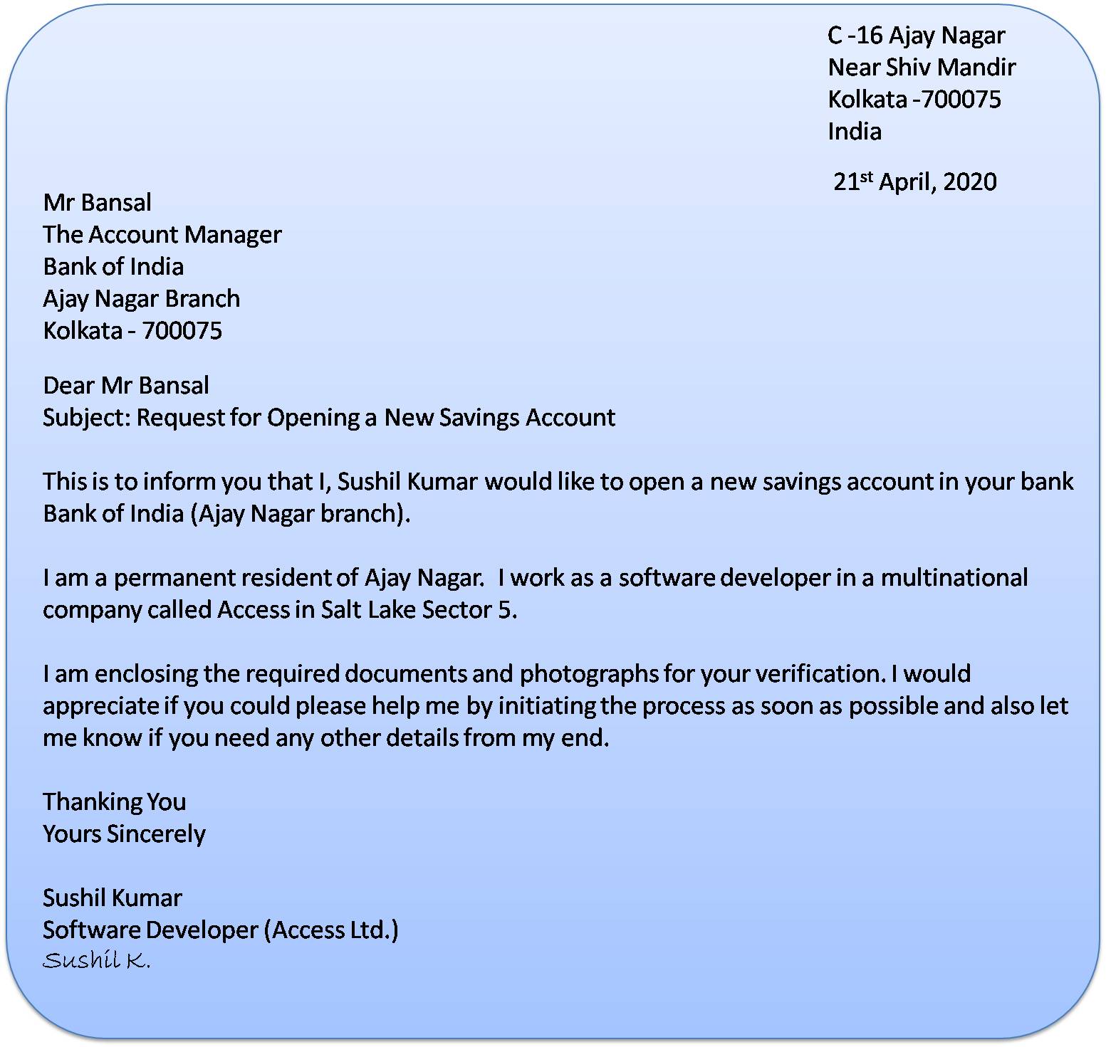
Decoding the Perfect Formal Letter Font
Crafting a formal letter is like dressing for an important occasion. Your words are the substance, but the font you choose is the attire. It sets the tone and conveys your respect for the recipient. Choosing the correct typeface for a professional letter goes beyond mere aesthetics; it impacts readability and conveys professionalism.
Formal letter font etiquette has evolved over time, influenced by printing technologies and cultural norms. The goal is always to present a clean, easy-to-read document that reflects seriousness and respect. So, what constitutes an appropriate formal letter font, and how can you ensure your correspondence makes the right impression?
Traditionally, fonts like Times New Roman, Arial, Calibri, and Garamond have been favored for formal letters due to their classic appearance and excellent readability. These fonts project a sense of professionalism and are widely accepted in business and official communication. Choosing the proper typography establishes a respectful tone and ensures your message is easily digested by the reader.
The history of formal letter fonts is intertwined with the development of printing. Initially, typefaces mimicked handwriting styles. As printing technology advanced, more standardized and legible fonts emerged. The rise of digital communication further broadened the available options, but the core principles of formality and readability remain paramount.
Understanding the nuances of formal letter font selection is crucial for effective communication. A poorly chosen font can detract from your message, while a well-chosen one enhances clarity and professionalism. In essence, the typeface you select is an extension of your professional image. It subtly communicates your attention to detail and respect for the recipient.
One key benefit of using a standard formal letter font is enhanced readability. These fonts are designed for clarity, making it easier for the recipient to quickly grasp the content of your letter. Another advantage is conveying professionalism. Traditional fonts create a serious and respectful tone, suitable for business correspondence, job applications, and other official communications.
Furthermore, using a standard font ensures compatibility across different devices and operating systems. This means your letter will appear as intended, regardless of the recipient's platform. This consistency is essential for ensuring your message is conveyed accurately and professionally.
Creating a compelling and professional formal letter involves several crucial steps. First, select a suitable font like Times New Roman or Arial, ensuring it's between 10 and 12 points for optimal readability. Maintain consistent formatting, including margins, line spacing, and paragraph structure. Pay attention to your salutation and closing, mirroring the formality of your chosen font.
A checklist for formatting your formal letter can ensure consistency and professionalism. Verify your chosen font, size, and style. Check margins, alignment, and spacing. Review the salutation, closing, and signature block for correctness and consistency with the overall tone.
Advantages and Disadvantages of Specific Formal Letter Fonts
| Font | Advantages | Disadvantages |
|---|---|---|
| Times New Roman | Classic, readable, widely accepted | Can appear slightly dated |
| Arial | Clean, modern, versatile | Can appear less formal in some contexts |
| Calibri | Modern, clean, default in many applications | Can lack personality |
A best practice for formal letter font selection is to stick to classic, easily readable typefaces. Avoid overly decorative or stylized fonts that might detract from the professionalism of your communication. Ensure the font size is appropriate, typically between 10 and 12 points, for ease of reading.
A challenge in choosing the right font is balancing formality with modernity. While traditional fonts are generally preferred, using a slightly more contemporary font like Calibri can be appropriate in certain contexts. The key is to maintain a professional and readable presentation, regardless of the specific font chosen.
One common question is whether to use serif or sans-serif fonts. Both are acceptable in formal letters, though serif fonts like Times New Roman are often perceived as more traditional. Another question is about font size. Sticking to 10 or 12 points ensures readability without appearing too large or small. What if the recipient has a different operating system? Using standard fonts ensures compatibility across platforms.
A helpful tip is to preview your letter before sending to ensure the font renders correctly and the overall appearance is professional. This final check can prevent formatting issues and ensure your letter makes the desired impression.
In conclusion, selecting the appropriate font for a formal letter is a seemingly small detail that holds significant weight. It's an element of professional etiquette that contributes to the overall impression you make on the recipient. By adhering to established conventions and prioritizing readability, you ensure your message is clearly communicated and received with the respect it deserves. Investing the time to carefully select and implement the correct typography demonstrates your attention to detail and strengthens your professional image. This seemingly small choice can have a large impact on the effectiveness of your written communication. So, take the time to choose wisely, and let your font reflect the professionalism of your message.
Unlocking toddler potential a deep dive into online learning games for 2 year olds
Unearth nfl draft day 3 gems finding the best available players
Time flies but your clock doesnt have to finding local clock repair


