Decoding the Font Universe: A Comprehensive Guide to Font Styles
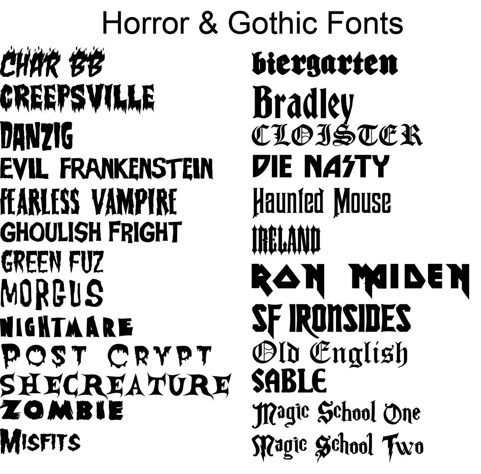
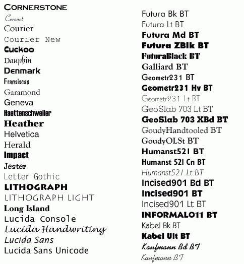
Ever wondered how a simple change in font can drastically alter the mood and message of a design? The world of typography is a rich and complex one, filled with a diverse array of font styles, each possessing its own unique personality and purpose. Understanding the nuances of these styles is crucial for anyone working in design, marketing, or any field where visual communication plays a significant role. This comprehensive guide will delve into the fascinating world of font styles, providing a comprehensive overview, practical examples, and valuable insights to help you navigate this typographic landscape.
From the elegant curves of serif fonts to the clean lines of sans-serif, the expressive strokes of script fonts to the bold statements made by display fonts, the possibilities are endless. Choosing the right font is akin to casting the right actor for a role – it can make or break the entire production. A poorly chosen font can confuse the message, while a well-chosen one can elevate it to new heights.
The history of font styles is deeply intertwined with the evolution of written language itself. From the earliest handwritten scripts to the invention of the printing press and the digital revolution, fonts have constantly adapted and evolved. Each era has left its mark on the typographic landscape, contributing to the diverse collection of styles we have today. Understanding this historical context can provide valuable insights into the characteristics and applications of different font families.
The importance of selecting the appropriate font style cannot be overstated. Fonts influence readability, convey brand personality, and set the overall tone of a design. A formal document might require a classic serif font like Times New Roman, while a modern tech startup might opt for a sleek sans-serif like Helvetica. The right font choice can enhance comprehension, create visual harmony, and ultimately, communicate effectively.
One of the main challenges in working with font styles is navigating the sheer volume of options available. With thousands of fonts at our fingertips, it can be overwhelming to select the perfect one for a specific project. Furthermore, understanding the subtle differences between similar fonts and ensuring cross-platform compatibility can also pose difficulties. This guide will equip you with the knowledge and tools to overcome these challenges and confidently choose the right font every time.
Serif fonts, characterized by small decorative strokes at the ends of letterforms, are often associated with tradition, formality, and authority. Think Times New Roman, Georgia, or Garamond. Sans-serif fonts, lacking these serifs, project a modern, clean, and minimalist aesthetic. Helvetica, Arial, and Futura are prime examples. Script fonts, mimicking handwriting, evoke elegance, creativity, and personality. Display fonts, designed for larger sizes and headlines, are often bold and expressive, used to grab attention and create impact.
Benefits of understanding font styles include improved readability and user experience, enhanced brand identity, and more effective communication. For instance, using a clear and legible font for body text improves readability, while using a font that aligns with the brand's personality strengthens brand recognition. Using a bold display font for headings can effectively highlight key information and improve communication.
When choosing fonts, consider your target audience, the purpose of the design, and the overall message you want to convey. Start with a clear understanding of your project's needs and then explore different font families to find the perfect match. Experiment with different combinations and test them on various devices to ensure optimal readability and visual appeal.
Advantages and Disadvantages of Different Font Styles
| Font Style | Advantages | Disadvantages |
|---|---|---|
| Serif | Readability in long texts, classic and traditional feel | Can appear outdated in modern designs |
| Sans-serif | Clean and modern, good for web and mobile | Can lack personality in certain contexts |
Frequently Asked Questions:
1. What is the difference between serif and sans-serif fonts? (Answered above)
2. What are display fonts used for? (Headlines and large text)
3. How do I choose the right font for my website? (Consider your brand and audience)
4. What are some popular font pairing combinations? (Serif body text with sans-serif headings)
5. How can I ensure my fonts are web-safe? (Use web fonts or common system fonts)
6. What are some good resources for finding free fonts? (Google Fonts, Font Squirrel)
7. How do I install fonts on my computer? (Follow operating system specific instructions)
8. What is kerning and tracking? (Kerning adjusts space between individual letters, tracking adjusts space between all letters in a word)
In conclusion, understanding the nuances of font styles is essential for effective visual communication. From the historical context to practical applications, the world of typography offers a rich tapestry of options. By carefully considering your project's needs, target audience, and the unique characteristics of each font style, you can harness the power of typography to create impactful and engaging designs. By exploring the diverse world of font styles, you can elevate your designs, strengthen your brand identity, and communicate your message with clarity and style. Take the time to experiment, explore, and discover the perfect font for your next project, and unlock the full potential of typographic expression. Remember, choosing the right font is more than just an aesthetic choice; it's a strategic decision that can significantly impact the success of your visual communication.
Unlocking the chevy 3500 gas towing powerhouse
Skull cap motorcycle helmet a risky trend or rebellious chic
Decoding mlb first round draft picks strategies successes and challenges


