Decoding 11pt Font: Size, Readability, and Best Practices
Ever wondered just how big 11pt font actually is? It's a question that crops up surprisingly often, especially in the world of document creation, web design, and print media. Choosing the right font size is crucial for readability, accessibility, and overall aesthetic appeal. This article dives deep into the world of 11pt font, exploring its dimensions, its history, and its practical applications.
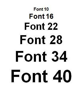
Understanding the size of 11pt font isn't as straightforward as you might think. It's not a fixed physical measurement like inches or centimeters. Instead, "pt" refers to points, a typographical unit of measurement. One point is approximately 1/72 of an inch. This means an 11pt font has a nominal height of approximately 11/72 of an inch. However, the actual rendered size can vary based on the font family, the operating system, and the software being used.
The perceived size of 11pt can also be affected by the font's design. A typeface with a large x-height (the height of lowercase letters like 'x') will appear larger than a typeface with a small x-height, even if both are set at 11pt. Factors like kerning (the spacing between individual letters) and leading (the space between lines of text) also influence how large or small the text appears.
Historically, 11pt font became a standard for many documents and printed materials. This stemmed from conventions in typography and printing practices. Before digital typography, typesetters worked with physical type, and certain sizes became established as norms for different purposes. The 11pt size found a niche as a balance between readability and space efficiency.
Today, the use of 11pt font continues, although it faces competition from other sizes. In the digital realm, screen resolutions and user preferences play a significant role in font size choices. While 11pt remains common for printed documents, website designers often opt for different sizes to optimize the reading experience on various devices. Readability is a key concern with any font size. A font that is too small can strain the eyes, while a font that is too large can make text appear clunky and difficult to navigate.
For example, a legal document might utilize 11pt font to ensure clarity and adherence to traditional formatting guidelines. An online article, however, might employ a slightly larger font size, like 12pt or 13pt, to enhance readability on screens.
One of the benefits of using 11pt font is its familiarity. Many readers are accustomed to this size, which can contribute to a comfortable reading experience. Another advantage is its relatively efficient use of space. Compared to larger sizes, 11pt allows for more text to fit on a page, reducing paper usage in printed documents.
Advantages and Disadvantages of 11pt Font
| Advantages | Disadvantages |
|---|---|
| Familiarity and readability for print | May be too small for some screens or readers with visual impairments |
| Relatively space-efficient | Not ideal for headlines or display text |
| Commonly accepted in professional documents | Can look cramped with certain font families or tight leading |
Best Practices for Using 11pt Font:
1. Consider your medium: Print vs. Digital
2. Pair with appropriate leading and kerning
3. Choose a legible font family
4. Test readability on different devices
5. Prioritize user experience and accessibility
Frequently Asked Questions:
1. What is a point (pt)? A point is a typographical unit of measurement, approximately 1/72 of an inch.
2. Is 11pt font suitable for websites? It can be, but consider larger sizes for improved screen readability.
3. What factors influence the perceived size of 11pt font? Font family, x-height, kerning, and leading.
4. Why is 11pt a common font size? Historical conventions and balance between readability and space efficiency.
5. How do I change font size in Microsoft Word? Use the font size dropdown menu in the Home tab.
6. Is 11pt font accessible for users with visual impairments? It might be challenging for some; consider larger sizes or adjustable font settings.
7. What are good font pairings with 11pt? Experiment with combinations, ensuring readability and visual harmony.
8. What's the difference between font size and font style? Font size refers to the height of characters, while font style refers to attributes like bold, italic, or underline.
Tips and tricks: Experiment with different fonts and sizes to find what works best for your project. Use online tools to preview font sizes and compare readability.
In conclusion, understanding the nuances of 11pt font is essential for creating effective and accessible content. While it remains a prevalent size, particularly in print, considering factors like readability, medium, and user experience is crucial. By applying the best practices outlined above and choosing the right font size for your specific needs, you can ensure your message is clear, engaging, and accessible to all. Choosing the right font size greatly impacts how your audience interacts with your content. Remember to test different options and prioritize clear communication. Taking the time to carefully select and implement your font sizes will contribute significantly to the overall success of your written materials, both online and in print. This attention to detail demonstrates professionalism and a commitment to providing a positive reading experience.
Maizy chens last chance a culinary journey you wont forget
Lifting spirits how to comfort someone whos feeling down
Are lungs part of the cardiovascular system unveiling the truth


