Crack the Code: Ideal Font Sizes for Pro Docs
Ever stared at a document, feeling like your eyes are crossing? Maybe the font was microscopic, or perhaps it resembled a giant billboard. Choosing the right font size for professional documents isn't just about aesthetics; it's about making your message clear, accessible, and, well, professional. This isn't just some design quirk; it's about effectively communicating your ideas.
Picking the correct font size can make or break your document's impact. Too small, and your reader will struggle, potentially missing key information. Too large, and it looks amateurish and overwhelming. So, how do you find that Goldilocks size – just right for clear communication? This guide dives into the nuances of professional font sizing, offering practical advice and real-world examples to help you nail the perfect look every time.
The standard font size for professional documents like business letters, reports, and resumes typically falls within the 10-12 point range. While this might seem like a narrow band, it’s the result of years of typographic study and practical application. These sizes have been found to strike the best balance between readability and efficient use of space. Deviations from this range can signal a lack of professionalism or, worse, make your document difficult to read.
While the "magic range" often works, optimal font sizing isn't a one-size-fits-all solution. The ideal size can vary based on the font itself, the document's purpose, and even the intended audience. A denser, more compact font might require a slightly larger size for comfortable reading, while a more open, airy font could function well at the smaller end of the spectrum. Considering these factors is crucial to creating a truly effective document.
Historically, the concept of standardized font sizes developed alongside the evolution of printing technology. As printing became more widespread, the need for consistency and readability became clear. Today, while we primarily interact with digital documents, these principles still hold true. A well-chosen font size contributes to a positive reading experience, enhancing comprehension and overall document effectiveness. The main issue revolves around finding the right balance between readability, aesthetics, and space efficiency, which can be tricky given the variety of fonts and document types.
One benefit of correct font sizing is improved readability. A 12-point font in Times New Roman is easy on the eyes, allowing for efficient information processing. Secondly, appropriate sizing conveys professionalism. Imagine a legal contract in Comic Sans at size 20! The right size strengthens credibility. Thirdly, it optimizes space. Choosing 11-point Calibri instead of 14-point Arial can save pages without sacrificing readability.
Advantages and Disadvantages of Different Font Sizes
| Font Size | Advantages | Disadvantages |
|---|---|---|
| 10pt | Conserves space, suitable for dense information | Can be difficult to read for extended periods, especially for those with vision impairment. |
| 12pt | Excellent readability, standard choice for most documents | May require more pages than smaller sizes. |
Best Practices:
1. Consider your audience: Older readers may benefit from slightly larger sizes.
2. Test different fonts: Not all 12-point fonts are created equal. Experiment!
3. Print a sample: Screen viewing can be deceptive. A physical copy reveals readability issues.
4. Use headings effectively: Larger headings provide visual structure and break up text.
5. Maintain consistency: Use the same font size throughout the document for body text.
FAQs:
1. What is the best font size for resumes? Generally, 10-12 point.
2. What about business letters? 12 point is usually recommended.
3. Is it ever okay to use a larger font size? Yes, for headings or documents for visually impaired readers.
4. What’s the smallest font size I should use? Avoid going below 10 point in most cases.
5. Does font choice impact sizing? Absolutely, some fonts appear larger or smaller than others at the same point size.
6. What font size should I use for academic papers? Often 12 pt, but check specific style guides.
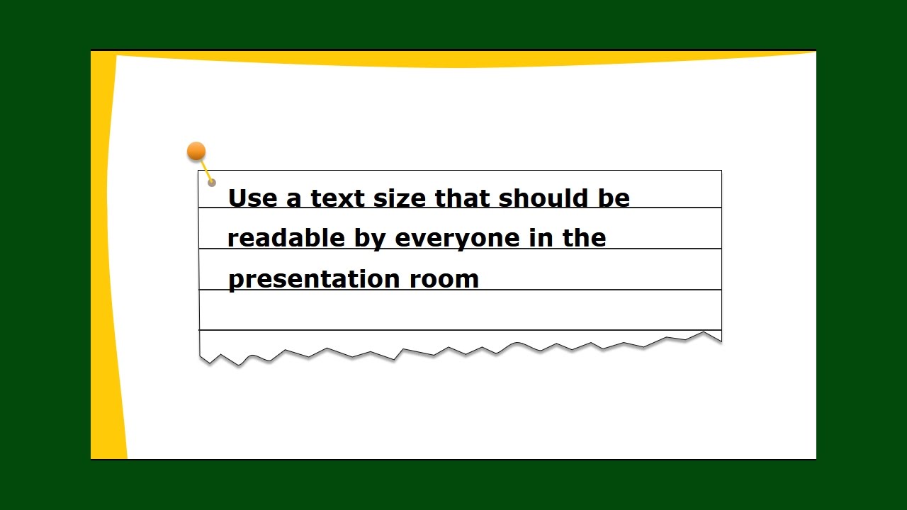
7. What font size should I use for presentations? Much larger, depending on the screen size and viewing distance.
8. How can I adjust font size in Microsoft Word? Use the font size dropdown menu in the Home tab.
Tips & Tricks:
Increase line spacing for improved readability with smaller font sizes.
Choosing the right font size is a seemingly small detail with a big impact. It affects readability, professionalism, and how your message is received. By understanding the principles of effective font sizing and applying the tips and best practices outlined here, you can elevate your documents from amateur to expert. Take the time to consider your audience, experiment with different options, and always prioritize clarity. Your readers (and your eyes) will thank you. Remember, clear communication starts with a readable document, and that journey begins with choosing the optimal font size. Don’t underestimate the power of this seemingly small detail – it truly can make or break your document’s success.
City of flint police dept navigating safety community challenges
The alluring story of maori tattoo half sleeves
Cruising into the future patterson dodge longview tx


:max_bytes(150000):strip_icc()/best-resume-font-size-and-type-2063125_Final-5c11507346e0fb0001edaaac.png)


