Blast From the Past: The Power of 90s Logo Design
Remember the days of dial-up internet, cassette tapes, and grunge fashion? The 1990s were a time of significant cultural shifts, and this extended to the world of design. The logos born from this era, often characterized by bold colors, playful geometry, and a sense of carefree experimentation, have a unique charm that continues to resonate today. But what is it about these retro designs that make them so enduringly appealing?
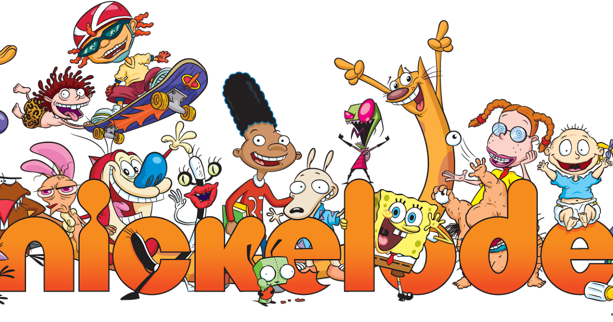
The resurgence of interest in 90s aesthetics isn't just about nostalgia. These logos tap into a sense of authenticity and a simpler time, a time before the digital landscape became oversaturated with sleek minimalism. There's a certain rawness and unpretentiousness to 90s design that feels refreshing in today's world. Think about the iconic logos of Nickelodeon, Toys "R" Us, or the playful wordart that dominated personal computer screens. These visuals weren't just brand markers; they were cultural touchstones.
One of the key reasons 90s logos remain relevant is their ability to evoke strong emotional connections. For many, these designs trigger happy childhood memories, instantly transporting them back to a time of Saturday morning cartoons and carefree days. This inherent nostalgia factor is a powerful tool for brands. When used effectively, it can foster a sense of familiarity and trust, connecting with consumers on a deeper, more personal level.
Moreover, the resurgence of 90s logos speaks to the cyclical nature of trends. What was once considered dated can quickly become fresh and exciting again. As we navigate an increasingly complex world, it's only natural to find comfort and inspiration in the past. This nostalgia-driven design trend allows brands to tap into a pre-existing visual language that consumers already understand and connect with.
However, simply slapping a neon gradient on your logo and calling it "retro" isn't enough. Successfully leveraging the appeal of 90s logo design requires a thoughtful approach. It's about understanding the core elements that made these designs so effective and adapting them to resonate with today's audiences. It's about capturing the spirit of the era—its optimism, its boldness, its sense of playful rebellion—and translating it into something relevant for a modern context.
While specific examples of 90s logos are numerous, it's more valuable to focus on the overarching trends and design principles that defined the era. This includes a penchant for vibrant, sometimes clashing, color palettes, the use of geometric shapes and patterns, and a willingness to experiment with typography and hand-drawn elements. By understanding these core principles, brands can create logos that capture the essence of the 90s while remaining relevant and engaging for a contemporary audience.
Ultimately, the renewed interest in 90s logo design highlights the powerful connection between visuals and emotions. It's a reminder that effective design goes beyond aesthetics; it's about telling a story, evoking a feeling, and forging a connection. By understanding the enduring appeal of these retro designs and adapting their core elements for a modern context, brands can tap into a rich vein of nostalgia, authenticity, and visual intrigue.
The enduring allure a glimpse into the world of hong kong actresses
Resurrecting your leather a deep dive into leather upholstery repair near you
Sunrise florida a year round paradise exploring the sunshine states climate


